brutalist structure
brutalism
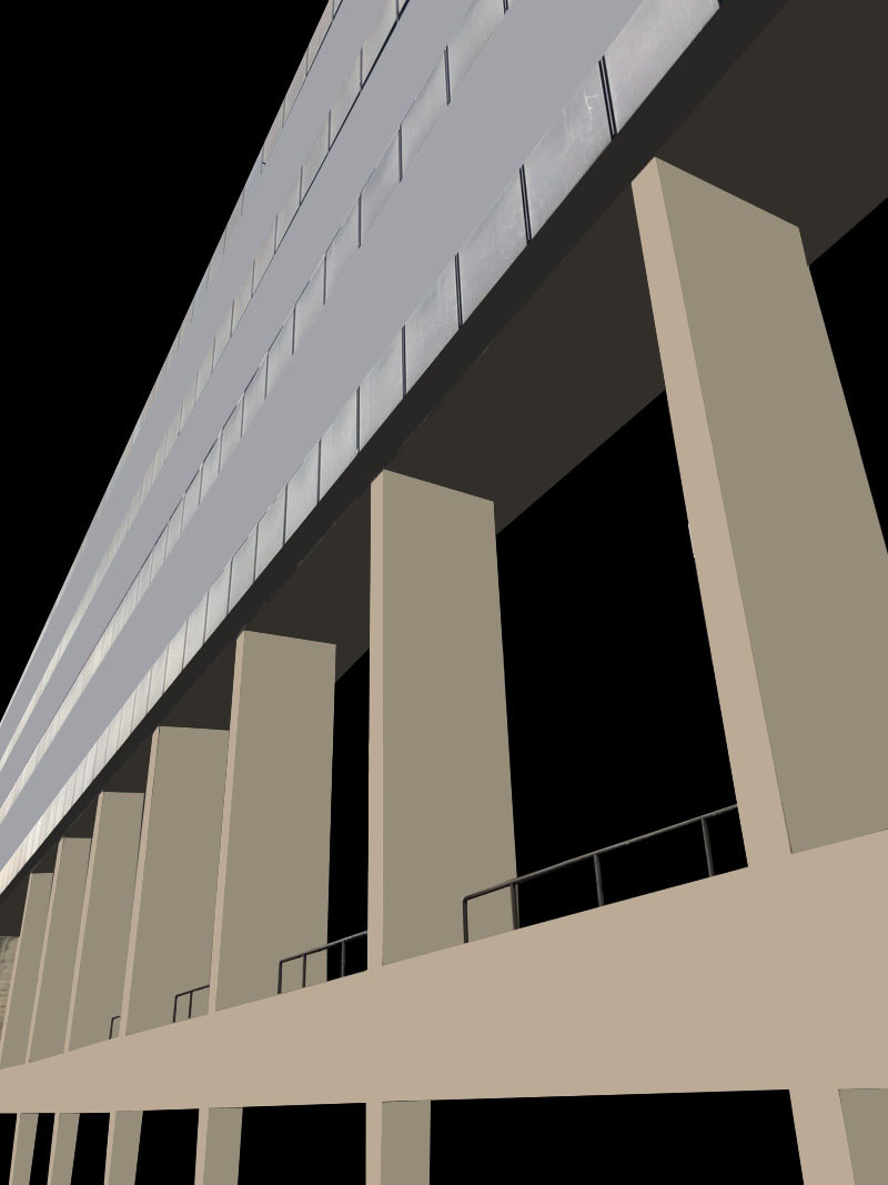
Brutalist architecture is an architectural style which emerged during the 1950s in the United Kingdom, among the reconstruction projects of the post-war era. Brutalist buildings are characterised by minimalist constructions that showcase the bare building materials and structural elements over decorative design.

|

|

|
simon phipps
Simon Phipps, born in Leeds, is an artist based In London. He is a graduate in sculpture from the Royal College of Art and a renowned photographer of post-war modernist architecture.
The photography displayed by Simon Phipps provides the audience with a unique perspective and portrays Brutalist architecture in a subtle, realistic and distinctive manner. Phipps has continuously documented Brutalist and buildings in the UK, creating a survey of photographic images that demonstrate the breadth of this contentious architectural style.
Phipps images his concerns are to to document and present post 1945 modernist British architecture that (loosely) fits into the idea of the social contract, that the state would provide housing and municipal buildings for the people. Brutaslism's creation fulfils the idea that these were functional, government buildings that served a very specific purpose and their design was meant to reflect that.
For this shoot I visited the locations of Russel square and Euston in order to photograph UCL buildings that resembled brutalist structure around the area.
|
|
|


shape and form

|

|

|
negative space

|

|

|
Line and perspective

|

|

|
extension work- Thomas Danthony
Danthony is a French photographer who had a unique take on brutalism in which he photographs brutalist structures and incorporates strong geometries and gradients in his designs, by simplifying them to the basic foundation. In order for attention to be drawn to the image he takes advantage of negative space thus isolating the building. As well as this his work consists of their strong angles, block colouring and hand-drawn feel in order to highlight the details of the building in the image.

|

|

|
my work
|
|

|
|
|
|
When editing these images I admire how the use of the black background filling all of the negative space really accentuates all of the buildings details, shapes and contrasts. The range of colours filling the individual blocks in the image helps to shape the building.
thomas kellner

|

|

|
Thomas Kellner is a German photographer, curator and lecturer. He captured famous architecture in order to edit them and create shifted camera perspectives in on image..
Thomas Kellner works with a single-lens camera and uses 35mm film small image rolls. Every image encompasses a dimension of twenty four × thirty six millimetres as well as every roll of film consists of thirty six individual frames. In order to transport the film, perforations are made at the top and bottom of each frame, on which both the type of film used and the number of each frame are noted. once developing the film, Kellner cuts it into strips of equal length and assembles them into one giant negative. This can be then wont to turn out the contact sheet, on that the meta-information concerning the film and also the various range of the shot remains visible.
Thomas Kellner works with a single-lens camera and uses 35mm film small image rolls. Every image encompasses a dimension of twenty four × thirty six millimetres as well as every roll of film consists of thirty six individual frames. In order to transport the film, perforations are made at the top and bottom of each frame, on which both the type of film used and the number of each frame are noted. once developing the film, Kellner cuts it into strips of equal length and assembles them into one giant negative. This can be then wont to turn out the contact sheet, on that the meta-information concerning the film and also the various range of the shot remains visible.
Bracketing
Bracketing is a technique used in photography where the photographer takes multiple shots of the same image, resulting in giving the photographer several different variations of the same shot. When bracketing you are primarily changing and adjusting the aperture on your camera whilst taking photos of the same image. To access this tool when altering the exposure level on your camera you look for the expsoure compensation button and then change from between the different expousres whilst taking the picture. This results in you having a wide variety of shots leaving you the option to pick the one with the best suited exposure.
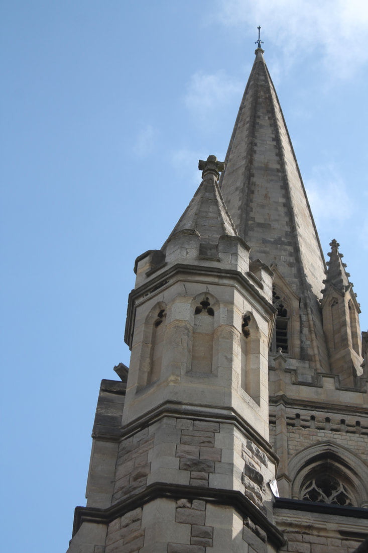
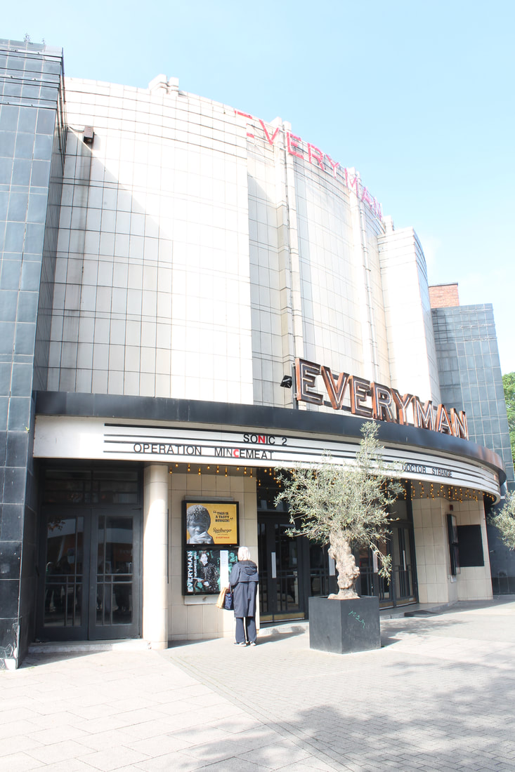
In order to complete this task we were required to go round Muswell hill and photograph the local church and the everyman cinema, below I have presented some of the photographs I managed to capture during this task. The two buildings we were asked to look at share some similarities in the way they are used.
In order to complete this task we were required to go round Muswell hill and photograph the local church and the everyman cinema, below I have presented some of the photographs I managed to capture during this task. The two buildings we were asked to look at share some similarities in the way they are used.
st james church
|
-2

|
-1

|

|
+1

|
+2

|

|

|

|

|

|
|

|

|

|

|

|

|

|

|

|

|

|

|
|

|
The everyman cinema

|

|

|

|

|

|

|

|

|

|

|

|

|

|

|

|

|

|

|
|
Nicholas Kennedy Sitton

|

|

|
Nicholas Kennedy Sitton is a San Francisco-based photographer that takes his photos of buildings and architecture and edits them to create this distorted, spiralling look.
The photos he takes result in a new intriguing outlook onto how the concept of distortion translates directly into architecture. In the image the appearance of the spiral forces this sense of the entirety of the image collapsing in on itself, almost falling, thus capturing a moment like capturing a moment just before obliteration and subsequently freezing the image in this moment for the viewer to look at. He was also said to be inspired by San Francisco as Sitton was in a new city at the time, which can be not only exiting but also disorienting to an extent.
"I wanted to capture how my whole world had changed.” - Nicholas Kennedy Sitton.

|

|

|

|
|
|

|

|

|
I liked how with my images there was a vast room for experimentation so I wasn't limited to just one way of editing, therefore I tried a variety of techniques, One I favour the most is the final one at the end In which everything in the photo except one stand is normal. I believe this adds to the intentions of the task as it appears the building is falling unto itself because the integretity and structure of the building relies on this one stand to be complete.
To improve, I could have tried to construct a more even circle so that the white lines didn't show up, but I think the white lines add to the spiralling effect by separating the circles more. Because of its shape and tall spire, the church created the best effect for twirling, but I prefer the vibrant colours of the everyman cinema, which bring interest to the image and make it less bland.
To improve, I could have tried to construct a more even circle so that the white lines didn't show up, but I think the white lines add to the spiralling effect by separating the circles more. Because of its shape and tall spire, the church created the best effect for twirling, but I prefer the vibrant colours of the everyman cinema, which bring interest to the image and make it less bland.
structure in nature
|

|

|
myoung ho lee
Myoung Ho Lee is a well-known young photographer from South Korea, his photography depicts trees in nature as isolated objects, due to their solitary-like structure, framed against a white backdrop in the middles of its natural surroundings. The use of the white backdrop forces the viewer to concentrate on the solidarity stance of the trees thus highlighting and separating them from their surroundings. His series of photographs forces the viewer look at the tree in its natural surroundings, but raises questions about environment, reality, art and representation. The process of his work is a challenge that can be broken down into four simple steps. First, the tree must be selected, then it will be separated from its environment artificially through the use of the white background, then photographed, and lastly he 'confirms the creation of identical chaos to the ‘Photography-Act’ itself by this separation and decontextualization'.
By separating the tree from nature it fully allows you to see the detailed structure of the trees however it would normally be a challange as your eyes are immediately overwhelmed with the hundreds of other vegetation also in the background.
By separating the tree from nature it fully allows you to see the detailed structure of the trees however it would normally be a challange as your eyes are immediately overwhelmed with the hundreds of other vegetation also in the background.
my shoot

|

|

|

In this task we went to the local Woods and took pictures of structures in nature inspired by Myoung Ho Lee. To fulfil the aims of the task we had to use a large A1 piece of white card and placed it behind different structures of trees and branches and leaves, isolating them. This allows us to look more in depth and appreciate at the shape of the plant without it camouflaging into its background.
|
best edits below


I like how these images highlight all the intricate details which would've normally been missed if not been isolated by the use of the white background. Furthermore this task made us look more closely at the individual structures doing their part in nature. I also like how in my images the separation of the individual plant from its overwhelming background of different organisms can create an atmosphere of calm.
sanna kanisto
- field work -

|

|
Sanna Kanisto is a photographer from Hameenlinna, Finland, whose work combines both art and science. During her fieldwork, she travels for two to three months per year, and visits rainforest areas such as Costa Rica. Kannisto follows scientists and works alongside them, photographing the work they do in scientific stations. In this way, Kannisto intends to photograph the interaction between art and science, as she uses metal clamps to hold various plants and animals. While undertaking her field work, she learnt how to handle animals and collect samples from nature.
For this task, we used a combination of scientific equipment like clamp and natural objects like exotic flowers to embody Kanistos work. I paired different leaves and flowers together to create arrangements of them. I also experimented by hanging some upside down to see how this looked as it gave it a more interesting dimension.
shoot

|

|
Below are my best selected four in which I felt expressed the intentions of the task perfectly
edits

|

|

|

|
In the photos I like how the contrast between man-made and nature is highlighted through the use of the clamp and the natural plants taken from the environment. As well as this the use of a white background helped significantly to drown out the noisy background and isolate the plant and clamp as an individual. However, when taking these photos I wasn' able to get a wide range of different placements as the clamp was not tight enough when I was photographing. This held back potential of interesting placements that could've been explored further.
three strands
- Creating a narrative -

|

|
Duane michals
Duane Michals is an American photographer. Michals's work makes innovative use of photo-sequences, often incorporating text to examine emotion and philosophy. His work derives from lifelong personal explorations into memory, mortality, temporality, sexual orientation, and spirituality.
Michals is a storyteller, turning the camera on himself at times to create frame-by-frame narratives in which he poses and performs as the subject in a mise-en-scène. He defies the constraints of visual language and structure by incorporating narrative directly onto the borders of photographs. While the use of definitional titles for artwork is ubiquitous, the interconnectivity of sequential images and the conjunction of text and image are distinctly Michals.
Michals is a storyteller, turning the camera on himself at times to create frame-by-frame narratives in which he poses and performs as the subject in a mise-en-scène. He defies the constraints of visual language and structure by incorporating narrative directly onto the borders of photographs. While the use of definitional titles for artwork is ubiquitous, the interconnectivity of sequential images and the conjunction of text and image are distinctly Michals.

|

|
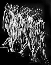
Francesca woodman
Woodman's intentions were to create surreal or claustrophobic scenarios. The movement captured is intentional, with it Woodman wanted to show you what you do not see, the body’s inner force. She did this by photographing blurred movement, she would often tend to blur out parts of her upper body like her head while another part was kept steady and not moving. She wanted to enforce the distortion of the image as she often places herself in this way.
Francesca Woodman has used long exposure in the camera to support her intentions of capturing movement in this piece of work which I decided to incorporate into my own development. It results in creating an atmospheric sense of melancholic isolation and stillness. In the photographs I took, the recurring pattern where the face is not visible is useful in the way I can provide the viewer with the assumption that my model wishes to escape from the camera just as woodmen wants and she uses a slow shutter speed to emphasize this.
My images below give an implication of a very dreary, uninviting atmosphere like woodman's style intends to create surreal and dark images as well.

|

|


|

|


three strands
-internal structure of the body-
Danny Quirk is a self taught medical illustrator and American artist who was best known for his series called 'Agnomical self dissections' He directed his work with a paintbrush to reveal the internal structure of the body, this turned unseen body painting into educational pieces. To create these painting he used a 2D canvas and water colours. Quirks aim of this series was to capture what the eye can't see, and exploring the darker side of photography. This included classical poses, dark luminous lighting all with a contemporary twist this highlighted what's underneath the skin and the figure that hides the structure that lays beneath.

|

|

|
Danny quirk
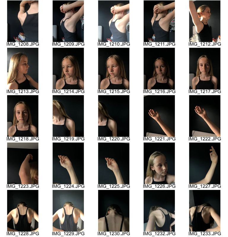
I like how I have used a dark background and dark clothing to add to the element of what the skull represents. As well as this, when editing I made sure to use a soft pressure size brush in order to successfully blend the outlines of the skull softly on her face. This helps in interpreting the theme of 'Internal structures' as it is more believable that it is the models skull.
|

|
three strands
-silent beauties-
For my third strand, which I am choosing to develop onward from, I have taken inspiration from the photographer Leendert Blok and his project 'silent beauties'. Blok spent time studying journalism in South Africa in the early 20th century, before returning to Lisse, near Amsterdam, where he became fascinated with the flowers cultivated in nurseries there. From tulips, daffodils and dahlias to hyacinths, irises and gladiolas, no specimen went untouched by his curious lens, and in pursuit of his passion, the photographer soon opened a company whose principal focus was the produce the display catalogues of the blooms created there.
His experiments with colour photography, still a relatively new technique at the time, draw his subjects out of their two dimensional format and into something new entirely; minute variations in colour, texture and form are magnified under his keen lens, seemingly blossoming into portraits rather than still life shots of inanimate objects. By capturing his subjects against plain, neutral backgrounds and lighting every blossom with precision, he was able to capture the subtlest nuances of texture, colour and form.
His experiments with colour photography, still a relatively new technique at the time, draw his subjects out of their two dimensional format and into something new entirely; minute variations in colour, texture and form are magnified under his keen lens, seemingly blossoming into portraits rather than still life shots of inanimate objects. By capturing his subjects against plain, neutral backgrounds and lighting every blossom with precision, he was able to capture the subtlest nuances of texture, colour and form.

|

|

|
In order to follow the inspiration of 'silent beautys' I went around my garden with a sheet of white card and targeted blooming flowers which displayed ranges of form, texture and colour. I like how The white background helped to isolate the flower from the overwhelming environment surrounding it. As well as this I made sure to photograph in direct light onto the image as lighting was of the utmost importance to the Leendert, leading him to illuminate each subject to create the sense of a tiny chiaroscuro sculpture cut out against a neutral background.

|

|

my edits


|

|


Also, I like how I have presented a wide range of coloured flowers each individually expressing different textures to their petals as well. These were some of the key features in which Leendert looked out for.
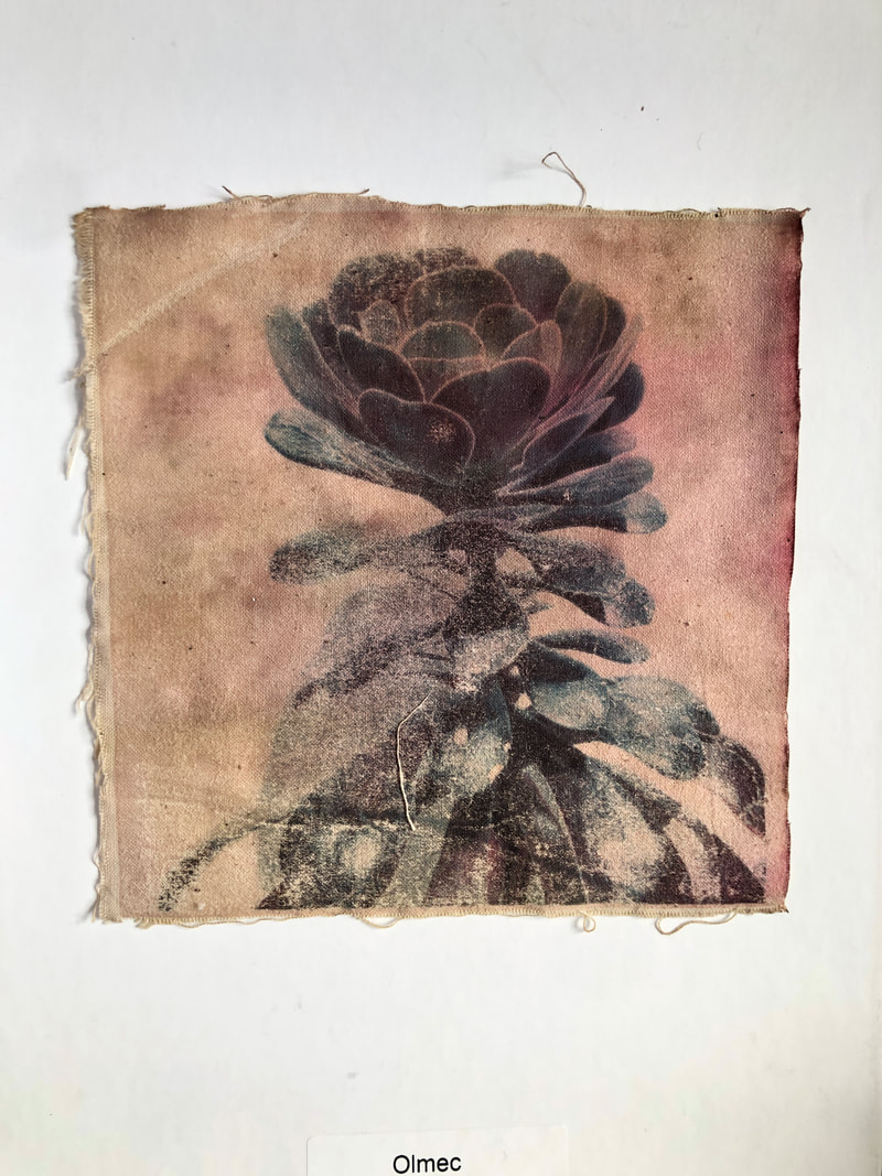
first development
For my first development i wish to link back to Leendert Blok's 'Silent Beauties', in which he photographed a wide range of beautiful blooming flowers concentrating on texture, colour and form. As he also found Lighting to hold utmost importance to the images, as they lead him to simply illuminate each subject to create the sense of a sculpture cut out against a neutral background. To further explore the neutral background used I decided to print out the following images onto a neutral coloured fabric in which I could experiment with dye from teabags.

|

|

|
|
|
Below are the results after being placed in the teabag solution. Before I placed them in the solution I had to transfer them onto the fabric with the use of an iron. When doing this I didn't wait for it to settle and removed the transfer paper immediately in order to elicit some form of texture on the fabric which is an element that Leendert greatly focused on. I admire how the use of the dye helped to enhance the colours within the photographs as well as providing a new perspective and forcing the audience to look at certain details they usually would not be aware of.

|

|

|


|
Further development(development two) - sewn features
To develop this strand even further I decided to add in some other structural features that would be unique to the specific plant itself. I did this by choosing a thread which complemented the dominant colour already in the print and used a backward stitch to thread the needle in a clean precise way. I like how the vines add more dimension and unseen 3d structural form to the image.

third development
- bleaching -
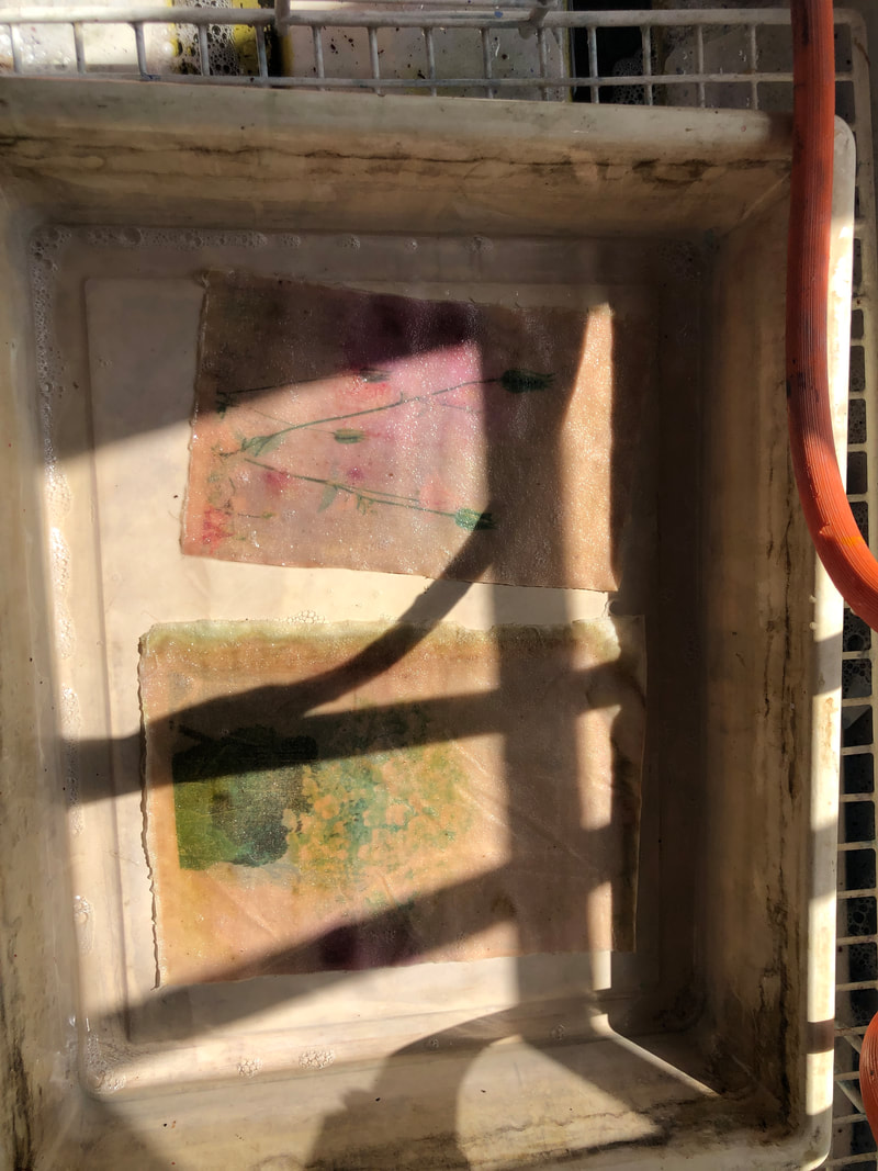
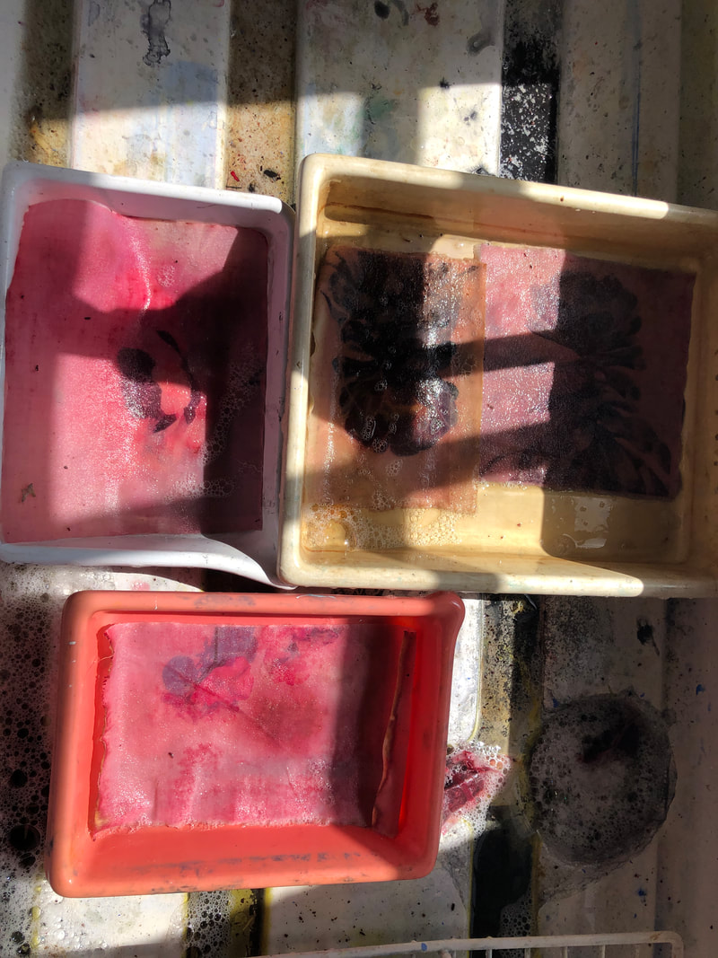
To develop this further, I decided to experiment with another experimental photography technique using film soup. After showcasing the unique effect a simple teabag had on the fabricated image I decided to bring in bleach to the development process. In order to create this decayed effect on the images below I needed to print my chosen images onto photographic paper as the bleach would then be able to strip away the individual layers. When selecting the photos which I would be using I chose to continue with flower images i used above so that i could fully explore the effect another experimental technique had on the same pictures in order to successfully compare.
Once the images were printed I rinsed and dried them so that they were prepped for bleaching. Applying the bleach to the chosen areas came next. Whilst i was applying the bleach I made sure to capture every change as bleach works very quickly and could've left me with unsatisfactory results. I applied the bleach in a variety of different ways for each of the prints.
Once the images were printed I rinsed and dried them so that they were prepped for bleaching. Applying the bleach to the chosen areas came next. Whilst i was applying the bleach I made sure to capture every change as bleach works very quickly and could've left me with unsatisfactory results. I applied the bleach in a variety of different ways for each of the prints.

|

|
When bleaching the image above I wanted to take advantage of the wide variety of colours and shades in the photo. In order to do so I poured a small spot of thick bleach, which has a very fast effect, to one area of the picture and then proceeded to tilt the image forward. This made the bleach move forward consequently taking the layers of colour with it. What i admire about this image is that you saw the individual layers of colour traveling along the image thus creating this illusion of colour breaking out of the image as if it was being held there contained.

|

|

|

However, when bleaching this image I used a brush and dipped it the watery bleach so that the effect would be slowed. I painted the bleach gently onto the leaves of the images thus isolating them and creating isolated features within an already isolated flower. This draws attention to more details in the flower.
|


|

|


|

|
Overall, I am pleased with the effect the bleach had on the individual images and I also liked how the audience is able to see a wide variety of ways the bleach has effected the image. What also went well was the part in which I made sure to take multiple photos of the processes that I didn't result in ending up with purely white images.
Fourth development
- decayed flowers -
For my fourth development I noticed the flowers when bleached portrayed an element of destruction and decay, as they broke the layers of the photo down, in which I wanted to further explore. For this development I decided to bring in knowledge from two previous developments: dyed with colour and destruction of object. For my fourth development I noticed the flowers when bleached portrayed an element of destruction and decay, as they broke the layers of the photo down, in which I wanted to further explore. For this development I decided to bring in knowledge from two previous developments: dyed with colour and destruction of object. As well as this In order to gain some inspiration I looked at the artist Kathrin Linkersdorff.
kathrin linkersdorff
Kathrin Linkersdorff was (born 1966, Berlin) trained as an architect. Influenced by extensive travelling and working in Japan she became fascinated by traditional Japanese culture. On her travels through the country, she learnt the technique of sumi-e, or Japanese inkwash painting, which significantly inspired her own sensitivity for beauty and composition of colour and form. Further research led her towards the aesthetic concept of wabi-sabi that perceives beauty in the acceptance and contemplation of transience, imperfection, and incompleteness of all things. Subsequently, her work echoes the trace of the natural cycle of life, celebrating the inherent beauty of the passing of time. This is where the decaying nature of flowers becomes relevant to her work as her project 'Florescence' show that despite how they are withered and in a decomposed condition, the title describes the process of blooming. It depicts how an Inner melancholy and gentle sadness expose a different side to the flower and could be seen to surpass the magnificence beauty of any flower in its greatest moment.

|

|

|
In her images the flowers decaying and bent stalks embody both pain and elegant abstraction, and would seem to be trying to voice something which is being hidden from the audience within the photo. The once rich and beautiful colours appear to be bleeding out of the flower heads as well as the crinkled appearance the petals portray, this lead to dehydrating my flowers after dying them to achieve the same form as hers.
Therefore I found perfectly healthy white flowers and had their stems dipped into dyed water using food colouring. This allowed the dye to travel up the flower, as well as this I also dipped the flowers petals into the dye itself in order to create a stronger effect. I used a mixture of different coloured dyes which resulted in a wide range of dyed flowers. After this I left them to dehydrate for several hours to see a decaying and death-like effect. This caused some flowers petals to roll up and others to have a crinkling effect on their petals. When photographing I remained using the white background in order to isolate the decayed flowers from a background infiltrated with noise.
Therefore I found perfectly healthy white flowers and had their stems dipped into dyed water using food colouring. This allowed the dye to travel up the flower, as well as this I also dipped the flowers petals into the dye itself in order to create a stronger effect. I used a mixture of different coloured dyes which resulted in a wide range of dyed flowers. After this I left them to dehydrate for several hours to see a decaying and death-like effect. This caused some flowers petals to roll up and others to have a crinkling effect on their petals. When photographing I remained using the white background in order to isolate the decayed flowers from a background infiltrated with noise.

|

|

|
My favourite selection are edited and presented below, I edited them to have extreme contrast and colour balance so that in my next planned development they would show up brightly on the fabric.

|

|


|

|

When critically evaluating the images above I love how the extreme colours used contrast strongly with the theme of destruction and decay, challenging themselves. As well as, when photographing I admire the composition and placing of the flowers in the image. As they are spaced in abstract ways forcing you to look at unique and different details of the petals you wouldn't normally see thus providing an entirely new perspective. However, for some of the images I would prefer to leave the flowers in the container for longer in order to see a more significant effect of the dye and dehydration. As well as this I feel I should've used a black background instead of white in order to contribute to the death and decay atmosphere.
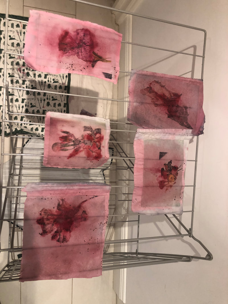
FIfth development
- dyed fabric prints -
For my final development I decided to further develop the idea of the contrast of beauty and life (through the flowers) with destruction and decay(through the use of the experimental techniques. For this I wanted to continue using my previous images of decayed flowers as they contribute to the overall theme, also I am going to use the technique of dying fabric as I like how the dye enhances the colours of the dying colours, thus creating a strong contrast between the two themes.
the process
For the process, I had to print out the following images onto transfer paper and then iron the printed photos onto a white sheet. After ironing I made sure to remove the peel as soon as possible so a layer of unique texture could be created. Then, I let the pictures dry so 20 minutes and lay them in trays. I placed teabags in the areas in which i wanted the colour to 'bleed' out the dead flowers. The soaked for several hours and then dried on a hanger. Once they were dry with the left over teabags I dabbed them on some specific areas to enhance the colour.

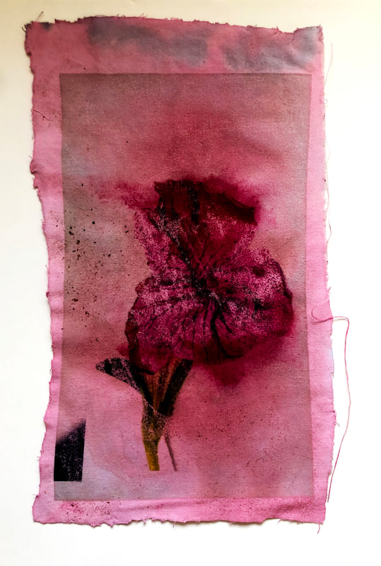
final images

|

|


When evaluating these pieces I'm fond of the way the dye from the teabags manipulate the flower to appear as if the life is being drained from it, this connotes to the theme of decay and death which is what is being outlined in the intentions of the development. However, the strength of colour in the prints could be improved so for next time i would aim to use more dye.
To alter this problem I edited the images in photoshop by modifying the contrast and brightness levels to bring out and highlight those dark areas within the photo thus making it more powerful. I also modifyed the levels setting in the photographs to add more potent colouring to the image.
To alter this problem I edited the images in photoshop by modifying the contrast and brightness levels to bring out and highlight those dark areas within the photo thus making it more powerful. I also modifyed the levels setting in the photographs to add more potent colouring to the image.
|

|

|

|
After editing my final pieces, I like how the colour has been enhanced strongly and defiantly thus drawing more attention to the highlighted sections of it. As well as this, the ripped like texture adds to the intention of destruction further complementing the theme. The contrast between the light areas of the image and the dark areas of the image has been heightened resulting in more levels of different dimensions being included within the image which leads to more attention being haltered towards the image.
